What is the HTML Widget?
The HTML Widget is the tool used most often when building Knowledge Connection site pages. The Widget uses simple and familiar formatting buttons and menus that function much like what you have seen in word processing software. You can use these tools, or HTML code, to enter text, images and resources.
The tool is set up to be very simple to use for those who are not experts at creating webpages, but also includes access to more complex formatting using HTML and CSS for those who are more experienced.
The HTML Widget uses a WYSIWYG Editor (WYSIWYG is an acronym for "What You See Is What You Get"). A WYSIWYG editor is a system in which onscreen content (text, graphics, etc.) appears during editing in a form that closely corresponds to its appearance when displayed in its finished form. This means that you can enter your content just as you want it to display--there is no need to be familiar with code.
The following list explains the available functions in the HTML Editor tool:
 - Bolds the selected text.
 - Italicizes the selected text.
 - Justifies the text left, center, right or full.
 - Creates bullet/unordered and numbered/ordered lists.
 - Click the down caret to reveal options for different bullets and numbering styles.
 - Adjusts the left padding in a line to indent or outdent. Note that the tab key does not function as it would in word processing software.
 - Click the down caret next to the underlined A to reveal a selection of font colors. Selecting a color changes the color of the selected text. The shaded A button changes the background color for the selected text.
- Use the Format drop-down menu to add other formatting such as:
- Underline
- Strikethrough
- Superscript
- Subscript
- Headers
- Use the Insert drop-down menu to insert
- Special Characters
- Horizontal Line
- Anchor--used to link directly to this location from another page
- Page Break--requires additional formatting in HTML and CSS. If you are not proficient in those area, we recommend that you do not use the page break
- Insert Date/Time
- Nonbreaking Space--inserts an HTML code that is recognized by the browser. Spaces created by pressing the space bar or enter key are not recognized by the browser unless they include text
- Use the View drop-down menu to adjust what is displayed in the HTML editor:
- Show Invisible Characters--highlight the nonbreaking spaces so that you know where they are
- Show Blocks--displays a wireframe representation of HTML tags used for paragraphs, headers and HTML divs
- Visual Aids--displays the wireframe representation of table borders
- Preview--displays a browser representation of the content of the Widget. However, we recommend using the Preview Page link at the top of the screen after clicking Save so that you can see the entire page rather than just the single Widget.
- Fullscreen--uses the entire screen to display the content of the Widget. To toggle back to the default view, click the View dropdown and click Fullscreen again.
- Use the Table drop-down menu to insert tables. Mouse over the grid of rows and columns to select the number that you want in your table and then click. Grab the arrow in the corner of the table to resize it.
- Use the Tools drop-down menu to acccess the HTML Source Code. See the section below for more information.
- Use the Bootstrap drop-down menu to insert Twitter Bootstrap Snippets. See the section below for more information.
- The
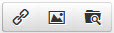 buttons are covered in the section below on Inserting Links, Images and Files.
The following buttons are a bit different than what you might have used in word processing. These buttons allow you to insert hyperlinks, images and files inline with your text.
To insert a link to another web page, click the  button.
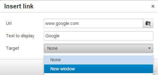
- In the URL field, enter the destination URL.
- To link to another page in your portal enter a "relative path" that has just the ending path of the URL. This "relative link" will take you to the desired page when you're testing on Staging, and when users use the link on Live. (And it would continue working even if you changed your domain name in the future.)
Example: "https://myportal.staging.knowledgeconnection.conduent.com/catalog". Enter only /catalog in the URL field. - To link to an external web page enter an "absolute path", but omit the "https:" protocol because the portal page you're viewing is already using https:.
Example: "https://www.google.com". Enter only //www.google.com in the URL field. The exception to this is if the target web site for reason required http: --then you'd have to include the protocol (http://VeryUncommon.com).
- To link to another page in your portal enter a "relative path" that has just the ending path of the URL. This "relative link" will take you to the desired page when you're testing on Staging, and when users use the link on Live. (And it would continue working even if you changed your domain name in the future.)
- The Text to Display field will automatically populate with the URL. You can edit this field by selecting the text and entering the new text.
- The Target field provides the option of having the link open in a new window or tab.
- Click

 button.
- Click on the
 button to the right of the Source field to select or upload the image file. This will open your image bank with all of the images you have uploaded.
- If the image you want to use is already displayed, simply click on the image and click
 and the Source field will populate with the correct path. Click
  and the image will be inserted.
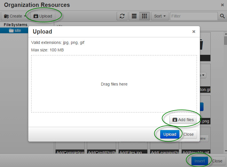
- If you want to upload a new image, click on the
 button.
- Drag the image file(s) onto the screen or click on the
 button. Select one or more images and then click the
  button. When all of the images have uploaded 100%, click
  .
. - Be sure that the image you want to use has been selected and click and then .
- Drag the image file(s) onto the screen or click on the
- To edit an image, click on it to select and then click the button.
- To delete an image, click on it to select and then simply hit the delete key.
Note: The image will be displayed with the same height and width dimensions as were used when the image was uploaded. If those dimensions are smaller than the HTML Widget containing the image, the image will be displayed with those dimensions. If the images is larger than the HTML Widget, the image will automatically scale to the size of the Widget.
Note: You cannot cut and paste images from a word processing document.
Note: Valid extensions are jpg, png, gif
Note: Max size: 100 MB
button.
- Click on the button to the right of the Source field to select or upload the file. This will open your resource bank with all of the files you have uploaded.
- If the file you want to use is already displayed, simply click on the file and click and the Source field will populate with the correct path. Click and the file will be inserted.
- See the section above on Uploading and Inserting Images for details on how to upload a new file.
Note: Valid file extensions are jpg, jpeg, png, gif, html, htm, txt, docx, doc, zip, pdf, swf, flv, avi, mpg, mov, js, css, xml, pptx, ppt, xls, xlsx, xlsm
Note: Max size: 100 MB
Knowledge Connection is built on the Twitter Bootstrap framework. This framework is a comprehensive system of scripts designed to facilitate the use of features and formats for creating mobile optimized web pages.
The Bootstrap Button
The bootstrap button provides access to twelve sets of Twitter Bootstrap code snippets. By clicking on items in the drop-down list, you will insert the code for that function.
These Bootstrap snippets let you add formatting without needing much experience with HTML code. Some of the snippets may require some editing in the source code if you want them to function in a certain way, but most of them can be edited directly in the WYSIWYG editor. This is a great feature to make it easier to customize and format your site pages.
Each Bootstrap Snippet is defined below:
You are viewing content inside multiple accordions on this page! Each of our help pages use this Bootstrap snippet to divide areas of content and make it easier to just view what you are interested in. You click a header link to collapse the open text box and expand the next. Clicking on the header of an expanded text box closes it.
Example Accordion with Tips for editing:
If you will be using the default 3 text box accordion (like the one you're looking at now), you are able to add basic text without editing the HTML code.
- You can click on each header ("Collapsible Group Item") and edit the text.
*Tip: If you try to delete the header to enter a new one, the link will be disabled. Instead, highlight all of the text except the first letter, make your change and then remove the first letter. Example: 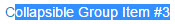
- To edit the text inside the first (open) text box, highlight it and make your changes. Click .
- When not in the HTML Widget edit mode, open the second accordion text box and then click the
 icon to edit the Widget again.
 - Now you can edit the text in the second box. Save, click the header to open the third box, and click the edit icon to open edit mode again and edit the third accordion text box.
- When not in the HTML Widget edit mode, open the second accordion text box and then click the
- After editing all 3 text boxes, save your changes. When not in edit mode, open any texxt box that you would like to be open by default, click the edit icon again and save. This will set your accordion to its default view.
Below is an example of the Source Code for an accordion. The header, text, and order number are highlighted in each. To add another text box, you can copy an entire section shown below (one of the paragraphs shown) and add it to the bottom. You will need to remove the last </div> and add it to the bottom of your new text box code.
Example of the Source Code for an accordion:
<div class="accordion" id="accordion_73">
<div class="accordion-group">
<div class="accordion-heading"><a class="accordion-toggle" data-toggle="collapse" data-parent="#accordion_73" href="#accordion_73_collapse1">Collapsible Group Item #1</a></div>
<div id="accordion_73_collapse1" class="accordion-body collapse in">
<div class="accordion-inner">Lorem ipsum dolor sit amet, consectetur adipiscing elit. Praesent iaculis est ac dui convallis porta adipiscing ante lobortis. Aenean volutpat mollis pretium. Ut eu enim dolor, vitae tincidunt odio. Aenean iaculis nibh id nibh venenatis ac hendrerit turpis tempor.</div>
</div>
</div>
<div class="accordion-group">
<div class="accordion-heading"><a class="accordion-toggle" data-toggle="collapse" data-parent="#accordion_73" href="#accordion_73_collapse2">Collapsible Group Item #2</a></div>
<div id="accordion_73_collapse2" class="accordion-body collapse">
<div class="accordion-inner">Curabitur sit amet nunc sapien, a vehicula turpis. In auctor neque a ipsum rhoncus eu pulvinar eros consequat. Pellentesque ultrices, ipsum commodo adipiscing suscipit, nisi enim dapibus nunc, vitae convallis risus erat a felis.</div>
</div>
</div>
<div class="accordion-group">
<div class="accordion-heading"><a class="accordion-toggle" data-toggle="collapse" data-parent="#accordion_73" href="#accordion_73_collapse3">Collapsible Group Item #3</a></div>
<div id="accordion_73_collapse3" class="accordion-body collapse">
<div class="accordion-inner">Mauris felis odio, imperdiet sed posuere et, ultrices eget turpis. Morbi quis arcu ac quam hendrerit facilisis ut ac ligula. Praesent at lacus eros. Nam elit massa, vehicula ac sollicitudin non, sollicitudin tristique tellus. Nulla nisi magna, cursus nec vestibulum cursus, iaculis nec magna.</div>
</div>
</div>
</div>
Default:
*Tip: To avoid deleting the badge when editing the text, change the text but leave the first letter of the default text. After editing the text, place your curser after the first letter and hit the backspace key.
Default
Success
Warning
button to edit the URL, Text to Display and Target.To add a link to a button you must edit the source code.
- First, Add the button using the Bootstrap list.
- Click on Tools>Source Code and search in the HTML code for the button. The code will resemble this:
- <button class="btn-small btn" type="button">Default</button>
- Enclose the button tags in <a></a> then add the URL to the <a> tag as shown below (the highlighted text is where the URL is added):
- <a href="//help.knowledgeconnection.conduent.info"><button class="btn-small btn" type="button">Default</button></a>
- Click to save your changes to the source code.
Small:
Medium:
Large:
Heading
This is a simple jumbotron-style component for calling extra attention to featured content or information.
Media heading
Cras sit amet nibh libero, in gravida nulla. Nulla vel metus scelerisque ante sollicitudin commodo. Cras purus odio, vestibulum in vulputate at, tempus viverra turpis. Fusce condimentum nunc ac nisi vulputate fringilla. Donec lacinia congue felis in faucibus.
Example page header Subtext for header
As with the Accordion content, click Save, click the tab and then the edit icon to add or modify the content for each tab.
Content for the Welcome tab...
Content for the Locations tab...
Content for the About Us tab...
In the Tools menu, select Source Code to open a modal window that displays the HTML (and/or any CSS and/or any JavaScript) that you have added to the HTML Widget. If you are proficient in HTML, CSS, and JavaScript, this feature will be useful in making more complex formatting of the elements in the Widget.
The source code view is also useful when editing more complex HTML. TIP: After opening the source code dialog you can press Ctrl+A to select all the code, Ctrl+C to copy it, and then switch to a more robust HTML editor (such as Notepad++ or VS Code) to make changes. When done making changes, reverse the process (select all the modified code, copy it, switch back to the Source Code dialog to paste the changes).
When you're done editing the source code, click OK to accept the changes. If you want to keep those changes, then click Save in the HTML Widget.
HTML Widgets can include dotLiquid code, which can execute logic and access certain data, such as the organization configuration and learner details. The code executes server-side, so nothing gets output to the web browser unless you explicitly write dotLiquid code that outputs some data. See dotLiquid for more details.