Site Page Design Considerations
The following are things to consider when managing your learner's/member's/stakeholder's experience by designing site page content and customizing your portal.
- Where (what page/site) will your learners be coming from?
- Who is the learner?
- What are their skills/reading level/etc.?
- What technology will they be using to access the learning portal?
- What is the learner's expectations when getting to the portal?
- What is the purpose/objective of the page?
- What is the call to action?
- What do you want the learner to do when they land on the learning portal?
- How will they know what to do when they land on the learning portal?
- Will they comply with directions?
- Will they have the skills to follow your directions?
- Will they need an incentive to comply?
- What is the best tool/method for satisfying the objective?
- Text? Images? Video? etc.
- How will the learner get enrolled in products?
- Will you use a Catalog?
- Will you use Enrollment Codes?
How do I manage my Site Pages?
Administrators who have Site Page permissions will always see an Edit Page link on every page on staging. Clicking on this link will open the Edit Mode for the page.
The page edit mode will display 6 buttons called "Widgets" that are used to add different types of content to a page. See the section below for detailed information about each type of Widget.
Using the appropriate Widget, you can display items such as videos, images and text-based content. These elements can be dragged and dropped to your desired location on the page.
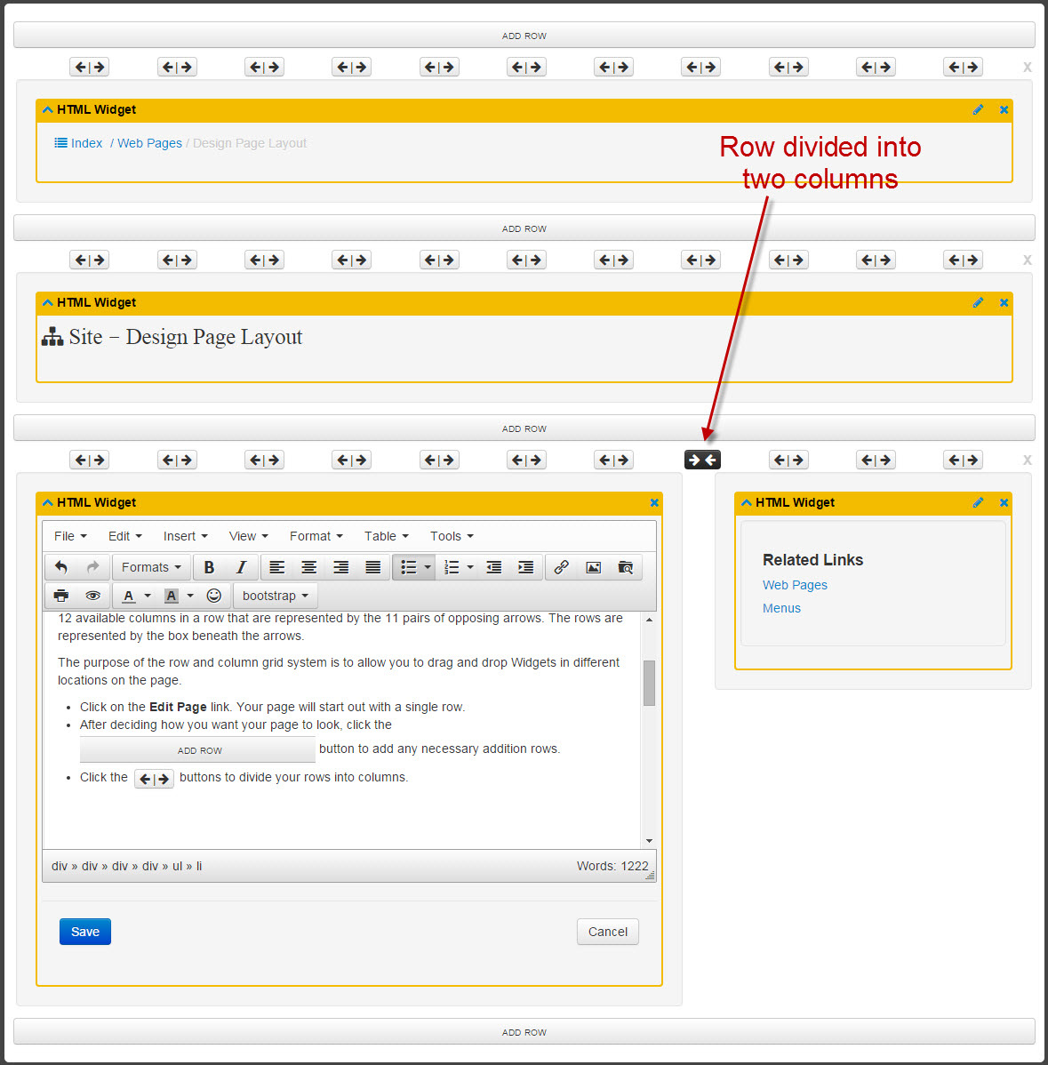
Layout Grid
The page content area will be displayed in a grid system consisting of rows and columns. There are 12 available columns in a row that are represented by the 11 pairs of opposing arrows. The rows are represented by the box beneath the arrows.
The purpose of the row and column grid system is to allow you to drag and drop Widgets in different locations on the page. The same framework is used on every site page.
- Click on the Edit Page link. Your new page will start out with a single row.
- After deciding how you want to lay out your page, click the
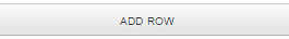 button to add any necessary additional rows.
- Click the
 buttons to divide your rows into columns.
- Drag and drop Widgets into the rows. Note that a wireframe outline will show up so that you know where the Widget will be dropped.
- Note that the Widget will completely fill the length of the row.
- You can move Widgets around the page by dragging and dropping.
- Edit Widgets by clicking on the
 icon at the top right corner of the Widget after it has been dropped on the page.
- Delete rows or Widgets by clicking on the X buttons. Note that deleting a row will also delete any Widgets that it contains.
- Click the Preview Page link at the top of the page to view the content as it will appear to your learners.
Example of Edit Mode on the page you are currently viewing:
What are Widgets?
Widgets are used to add content to a page. Your page can include any number of Widgets that can be used in combination to meet the objective of the site page.
You may have a page that includes some text and images in a few HTML Widgets, along with an Enrollment Code Widget and a Video Widget.
A page could be configured to include a short catalog with some HTML content and a badge feed. You have many options in the way that you design your page using Widgets.
Click on each link below for detailed information about each Widget:
What is a Template?
The site template makes up the area of the page that surrounds or frames the center part of the screen.
The template is designed and created during the implementation phase of your portal and is the same accross all site pages (unless your site has been set up with more than one template). You can provide a detailed mock-up of your desired template design, or simply ask us to mimic the colors and use the logo from your website. Many clients want the template to closly resemble their website to create a seamless transition for the learner.
Once complete and approved, the template is not editable and can only be modified by the Learner Community design team. Changes to the template after implementation may incur additional fees.
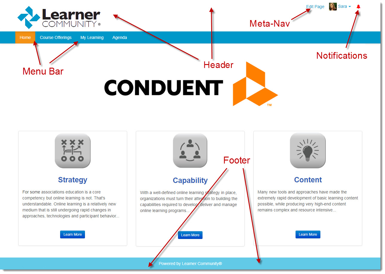
The top of the site template is the Header section that will house your logo and any other images that would support your brand or messaging.
Also in the header section is the drop-down menu that links to the Admin Dashboard, your My Account page, your My Public Profile page, and the Log In/Log Out screens. This menu is also referred to as the Meta-Nav. The information displayed by the meta-nav changes based on the status of the learner.
When logged in you will see a Bell Icon next to the meta-nav that will take you to a Notification Center. You will see a list of notifications such as "New Enrollment", "Credit Available for Claim", certain Section Admin notifcations, and more. If the bell icon is red, this means that you have un-viewed notifications.
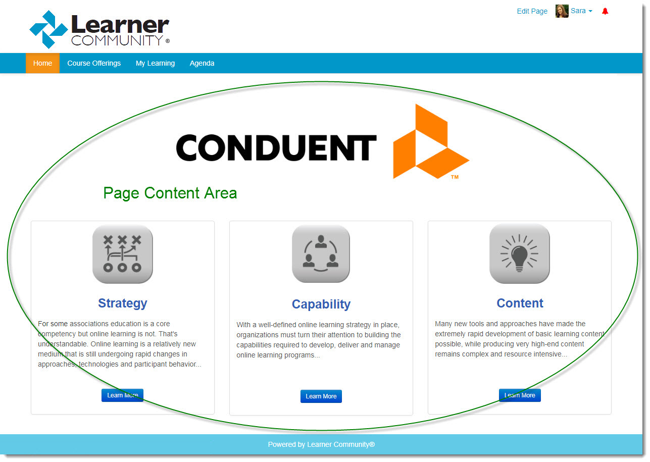
Page Content Area
The center area of the page is called the page content area. This is where you can add and edit content that can be used for messaging, providing your learners with directions and other information that will help them navigate the portal. Catalog information, learner enrollment information, lauched learning products and any content that you want to include will be displayed on this part of the page.